Explore the MyRedback App
The MyRedback App is an easy-to-use hub giving you quick on-the-go updates about your home’s solar generation, usage, and battery status.
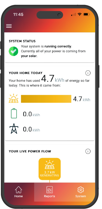
The first thing you will see when you log into the MyRedback app is the System Status and Your Home Today sections.
System Status
This section will provide a short update on how your system is running and a short summary of where your home’s energy comes from. If there’s a blackout, if your system is offline, or if your system requires attention, you will also see that noted in this section.
If you’re confused about a message you see in this section, please raise a Support Request with our Technical Support team.
My Home Today
This section will show you how much energy (in kWh or ‘kilowatt hours’) your home has used in a 24-hour period.
The icons underneath the total usage number show where your home’s used energy has come from in that period, and how much energy has come from that source.
- Top icon: Solar
- Middle icon: Home battery
- Bottom icon: Electricity grid
Your Live Power Flow
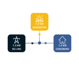
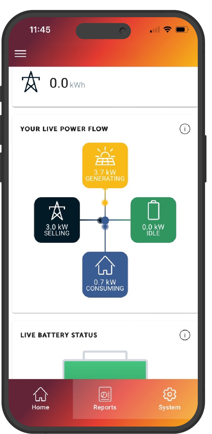
This live graph will visibly show you where your generated power is coming from, and where it’s going. As the dots move along the line, you’ll be able to see where your power is being diverted.
- The top icon shows your solar generation.
- The left icon shows power being sold to the grid.
- The bottom icon shows energy being consumed in the home.
- The right icon shows energy topping up your battery.
It is possible for the dots to move towards multiple icons, and for the dots to originate from different icons.
Underneath each icon, the rate at which each power source is generating, consuming, discharging or selling, will be displayed in kilowatts (kW).
If your battery is not discharging any power to your home, this text will display at ‘0.0kW’ and ‘idle’.
Live Battery Status
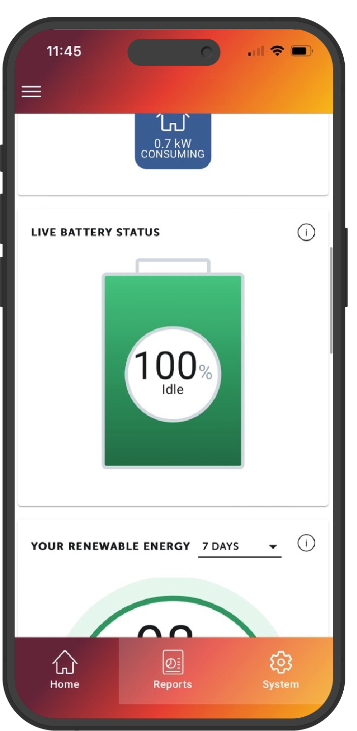
Homeowners with a home battery will see the Live Battery Status widget on their MyRedback App.
This section will show you how much charge your home battery system is holding as a percentage (%).
Underneath the percentage, the word ‘Idle’ will appear if your battery is not currently in use, ‘Charging’ if energy is being diverted into the battery, and ‘Discharging’ when it is in use.
Note: If you have an inverter only, and no battery, this section will not appear on your app screen.
Your Renewable Energy
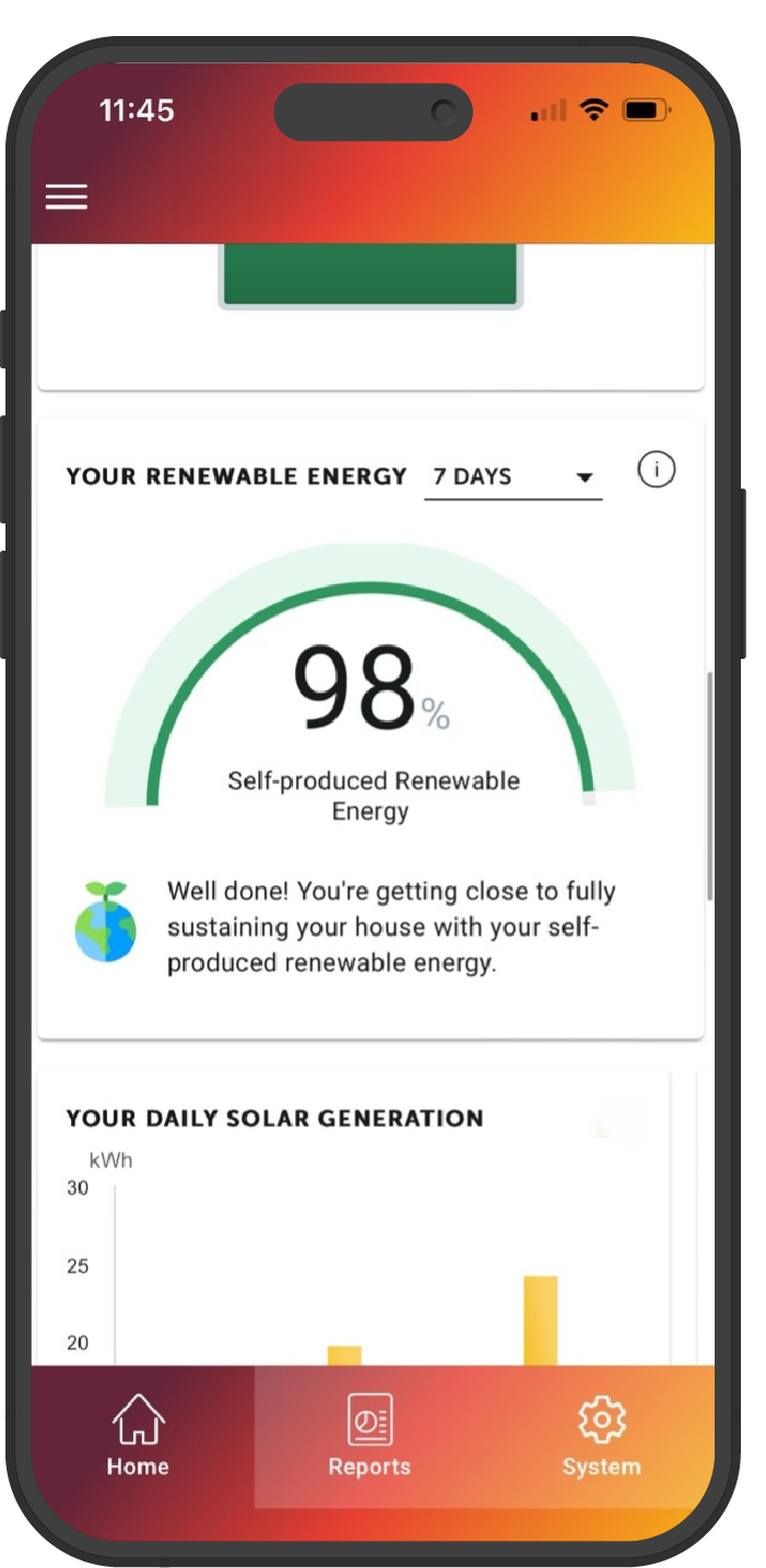
This section will tell you how much self-produced energy (%) you are using to power your home.
You can view your self-produced energy status in 7, 30, or 90 day increments by pressing the down arrow.
Your Daily Solar Generation
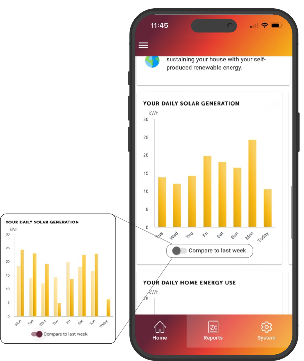
This graph will show you a day-by-day visual of your solar generation in kilowatt hours (kWh).
Press the ‘Compare to last week’ toggle to see a side-by-side analysis of this week’s generation vs. last week’s generation.
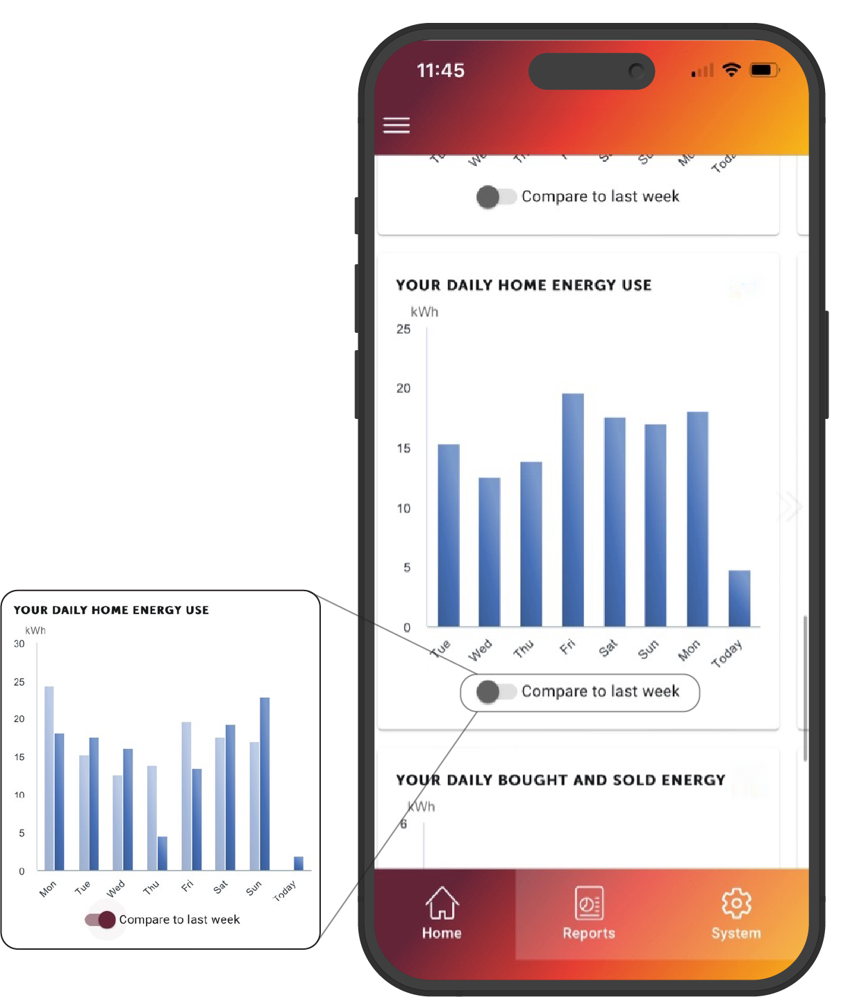
Your Daily Home Energy Use
This section will tell you how much self-produced energy (%) you are using to power your home.
You can view your self-produced energy status in 7, 30, or 90 day increments by pressing the down arrow.
Your Daily Bought and Sold Energy
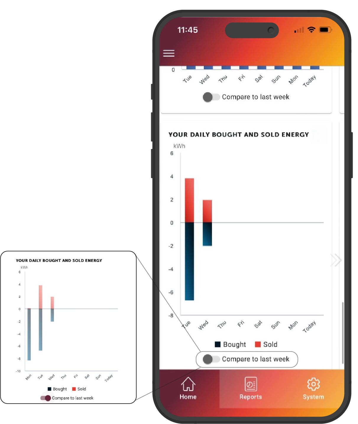
This graph will show you the amount of power in kilowatt hours (kWh) you bought and sold to the grid in a 7-day period.
The amount of power you bought from the grid is shown in navy bars, and the amount of power you sold to the grid is shown in red bars.
Consider the 0 line as the centre of the graph. Anything below that shows bought power, and anything above that shows sold power.
Note: While the numbers below the 0 line show a negative, this does not indicate that you are in a negative on bought/sold power.
As with the above graphs on the MyRedback app, you can also interact with the toggle to compare this data to the previous week’s data. Once you interact with the toggle, last week’s graph will independently populate.
Reports Tab
When you click the Reports tab on the bottom bar of the app, you’ll be given a month-by-month snapshot of how your system has been performing.
The information in this section will be categorised in the same format as the ‘Your Home Today’ section from the homepage.
You’ll be shown how much energy (in kWh) you have used each month.
The icons underneath the total usage number show where your home’s used energy has come from in that period, and how much energy has come from that source.
- Top icon: Solar
- Middle icon: Home battery
- Bottom icon: Electricity grid

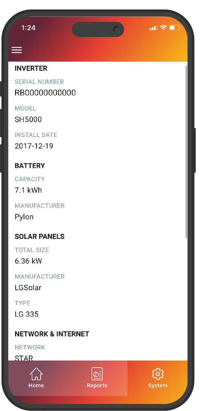
To access core information about your system, click the system button on the bottom banner of your app screen.
This screen will show you your inverter serial number, battery capacity (if applicable), install date, and internet information.
Importantly, if you scroll to the bottom of this section, you’ll find your installer’s details – keep these handy for any enquiries regarding your system or its performance.
Network Details
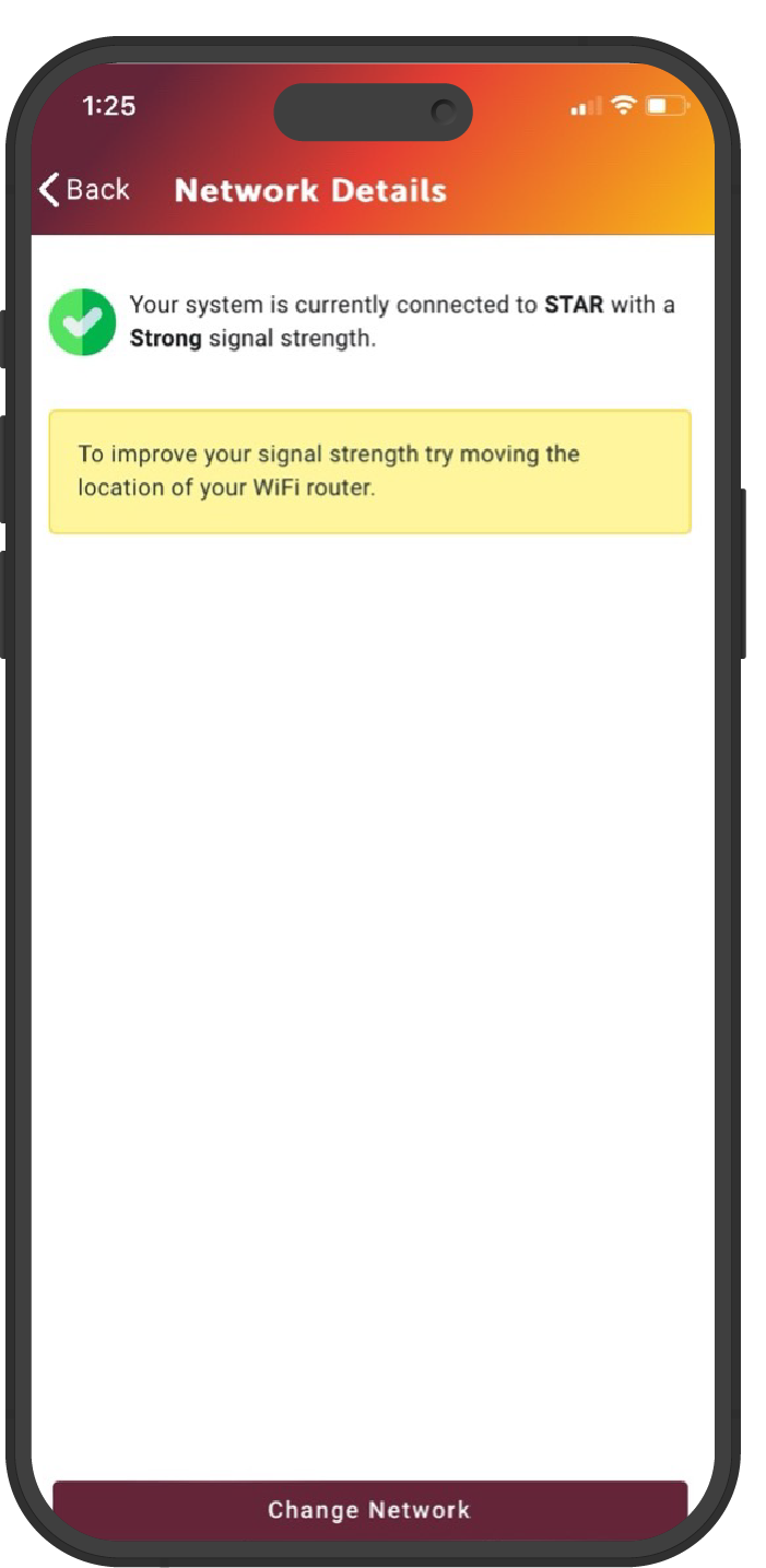
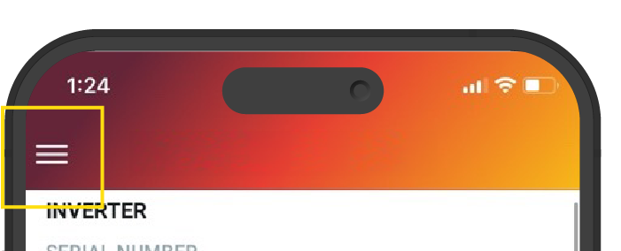
To access Network Details, press the ☰ button on the top-left of the app screen.
This screen will show you the status and strength of your internet connection.
Note, it is important that your system remains online at all times to ensure compliance with Redback’s Warranty Policies, and to also allow over-the-air updates and monitoring from our Technical Support Team.
If you have changed internet providers and need to update your connection, click the ‘Change Network’ button. Once you press this button you will be provided with instructions on how to ensure the new Wi-Fi connection is successful.
Note that this section will use Bluetooth to connect to a different network. Please ensure you have enabled Bluetooth on your device before proceeding with this step.
